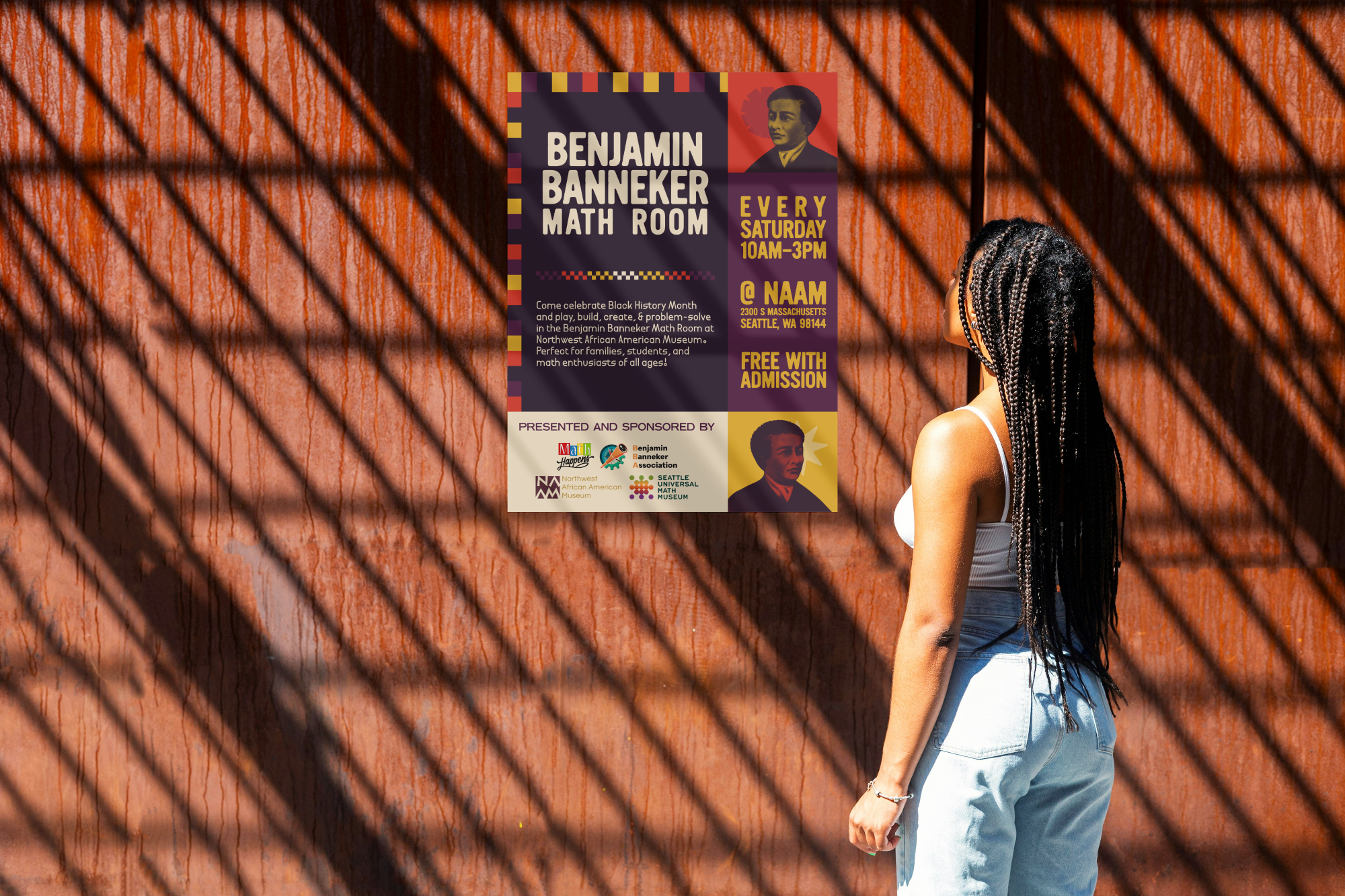
In late 2024, I got on a call with my bosses at the Seattle Universal Math Museum. They wanted to work with three organizations we have previous rapport with in order to create an exhibit focused on informal math education and math empowerment for Black and Brown children.
All of these organizations have very different visual identities and brand development. I wanted to make something that honored all four organizations' missions and branding, together at once.
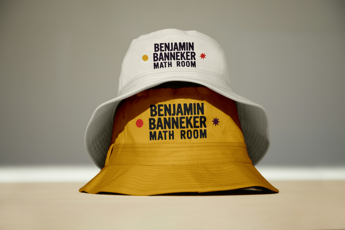
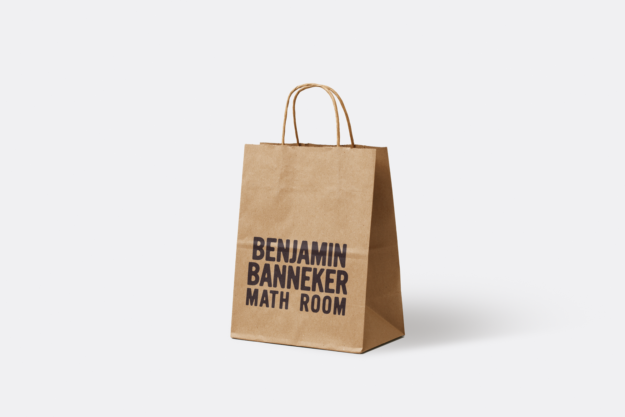
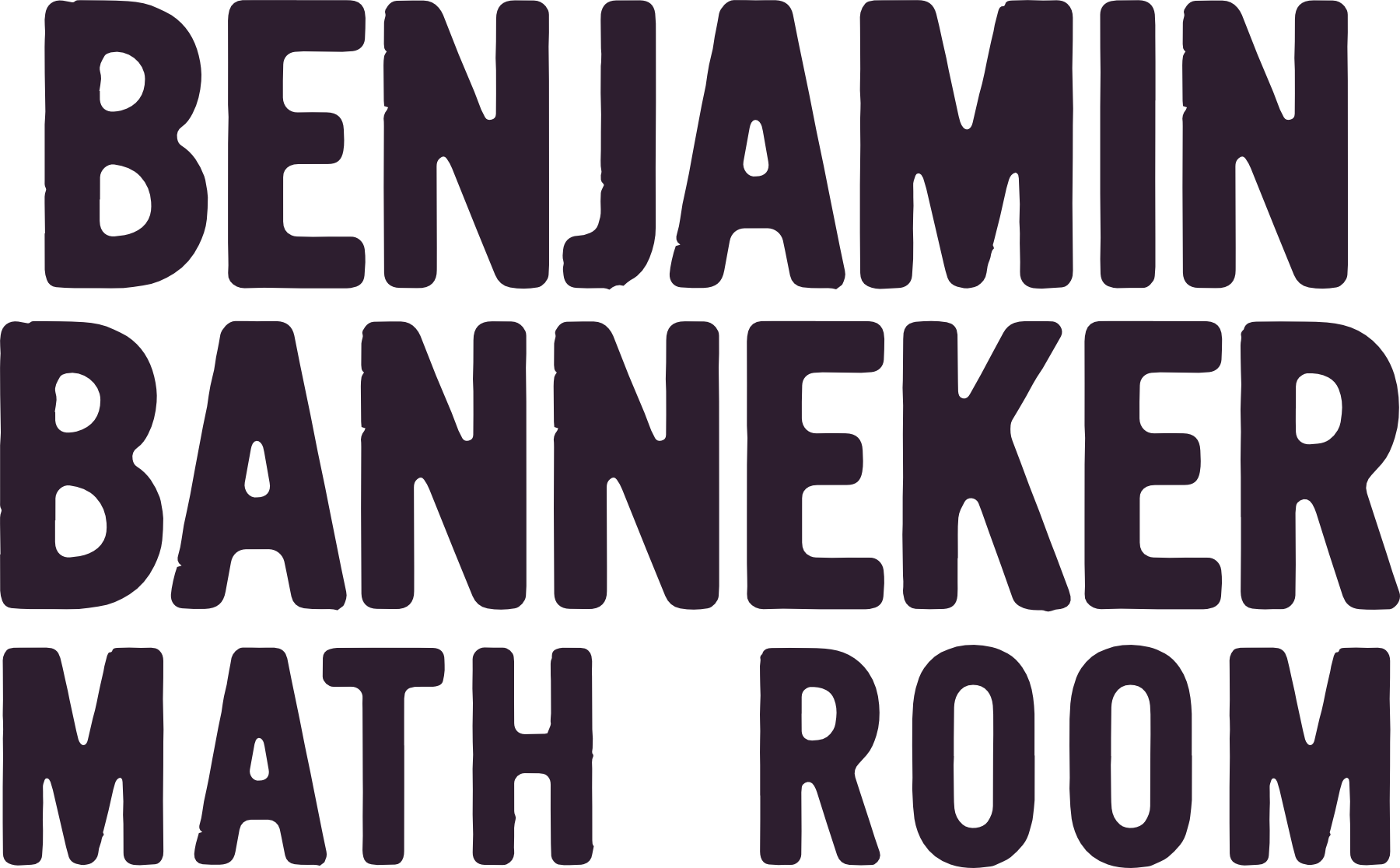
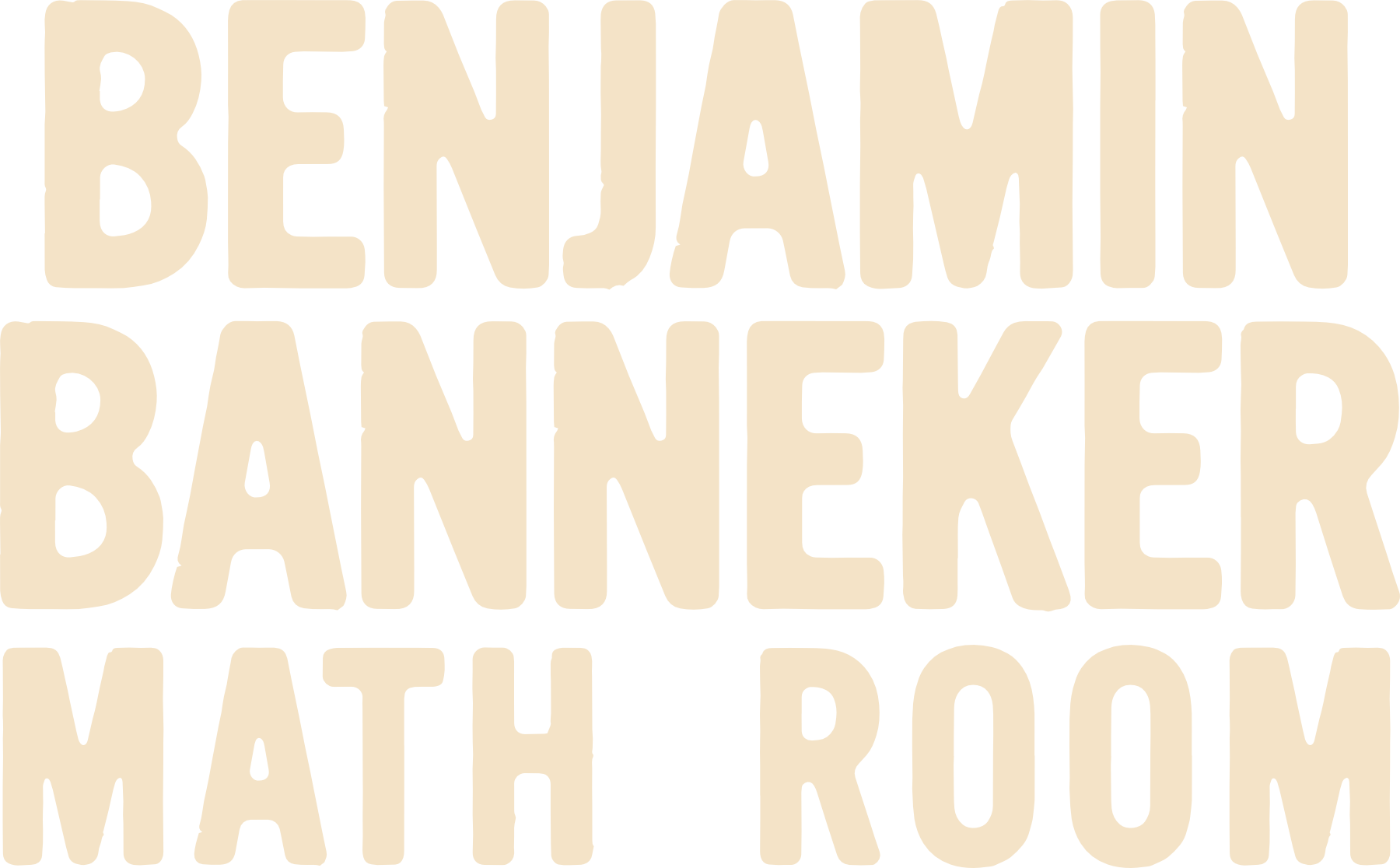
My brief was to create the logo, visual identity, and merchandise line for the Benjamin Banneker Math Room.


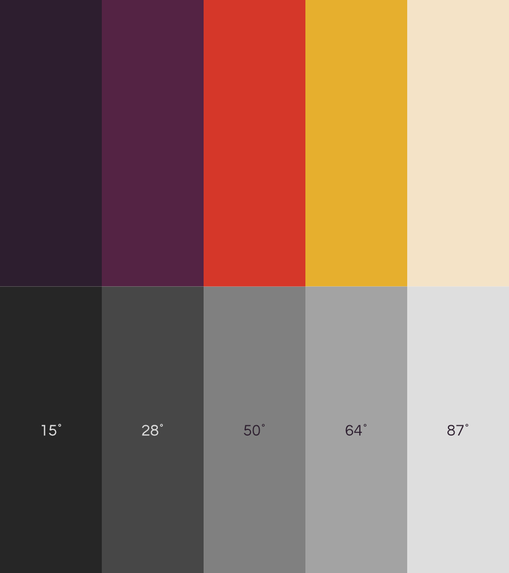
#D53729
9 / 90 / 88 / 1
7597 C
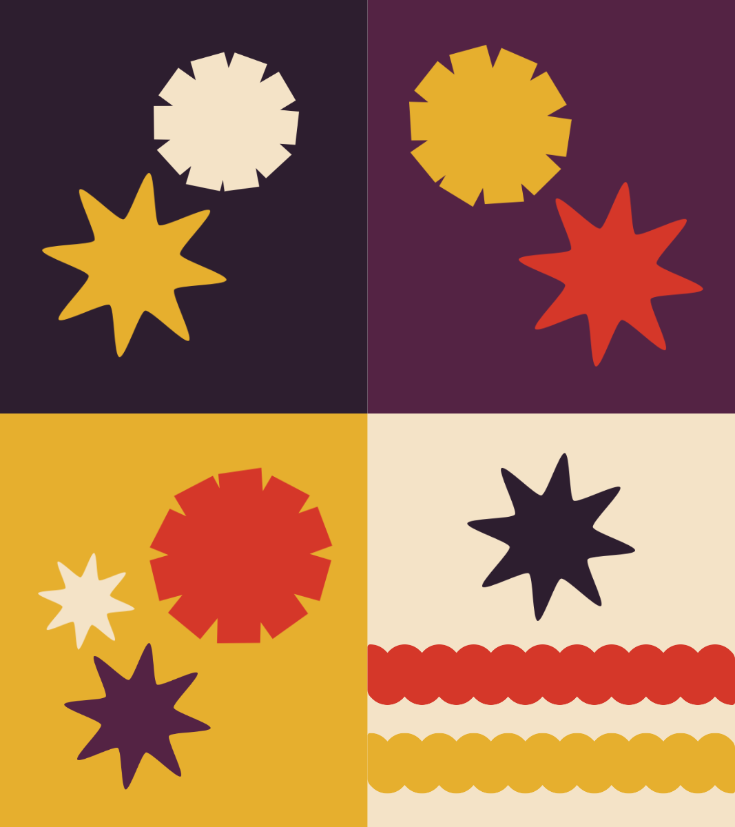
Each color used in this color palette was originally from one of the logos from each organization. I knew I wanted to stick with deep reddish-browns and warm colors, so choosing one color from each was an experimental starting point that worked well. When I was satisfied with tweaking the palette I built, it was easy to find a matching off-white that fit into the warmth and saturation of the color scheme.
Accessibility for visual impairments is very important to me, and so is making sure that this branding is ready for real-life scenarios that I see every day.
Vision impairments aren't limited to blindness, and can include conditions like colorblindness. It was important for me to also choose colors that were easily distinguishable for guests with three major types of colorblindness.
Understanding these vision impairments is crucial to ensure that designed materials are legible and understandable for all recipients, regardless of their color vision abilities.
#542344
60 / 91 / 38 / 47
7644 C
#2D1E2F
77 / 84 / 48 / 66
7449 C
#F4E3C7
4 / 12 / 26 / 0
7506 C
Monochromatic contrast refers to the amount that colors differ when viewed in grayscale. For people with vision impairments, it can be difficult to tell apart colors that are very similar in brightness. When colors blend together due to low contrast, it can lead to confusion or misinterpretation of the information being presented.
Though the brand identity created is in full-color, ensuring there’s enough monochromatic contrast makes a big difference in how well the content is understood. And because I've worked in environments like NAAM's and I know the tendency to slap a logo onto an 8.5" x 11" sheet and print in black-and-white, I knew that I needed to distinguish the differences in brightness.

#E6AF2E
9 / 33 / 89 / 1
143 C

I created three main shapes to use as auxiliary/additional branding: the flower, the eight-pointed star, and the ribbon.
The flower uses combined fragments of Format_1452's asterisk and the letters A and X. I see it as a representation of Banneker's almanac work to log seasons and crop growth. A coworker pointed out to be that it also kind of resembles the gear of a clock.
The star represents his building of America's first telescope and the star charts he wrote for Ben Franklin's almanac. I also wanted to acknowledge the time frame in which Banneker lived without directly referencing American colonialism. Pan-African nations have used the eight-pointed star as a decorative motif for millennia.
The ribbon invokes several motifs to me: the bobbing of waves like his tidal measurements, the tight curls of kinked hair, a tilled farm ready for crops like the farm he owned as a free man, or the frame of a coiled spring in the first American grandfather clock.